
Data Visualization
数据可视化
This project is part of the final assignment of one of my grad courses, IST 719 Information Visualization instructed by Professor Jeff Hemsley, at Syracuse University. It is an individual project which aims to clean and visualize the data through the R programming language and Adobe illustrator.
-
This file contains the Happiness Score for 153 countries along with the factors used to explain the score. The Happiness Score is a national average of the responses to the main life evaluation question asked in the Gallup World Poll (GWP).
The Happiness Score is explained by the following factors (columns):
GDP per capita;
Healthy Life Expectancy;
Social support;
Freedom to make;
life choices;
Generosity;
Corruption Perception.
-
Global citizens / politicians
-
World Happiness ranking overview by country and regions?
What makes the happiness country?
What elements are correlated to the happiness score?
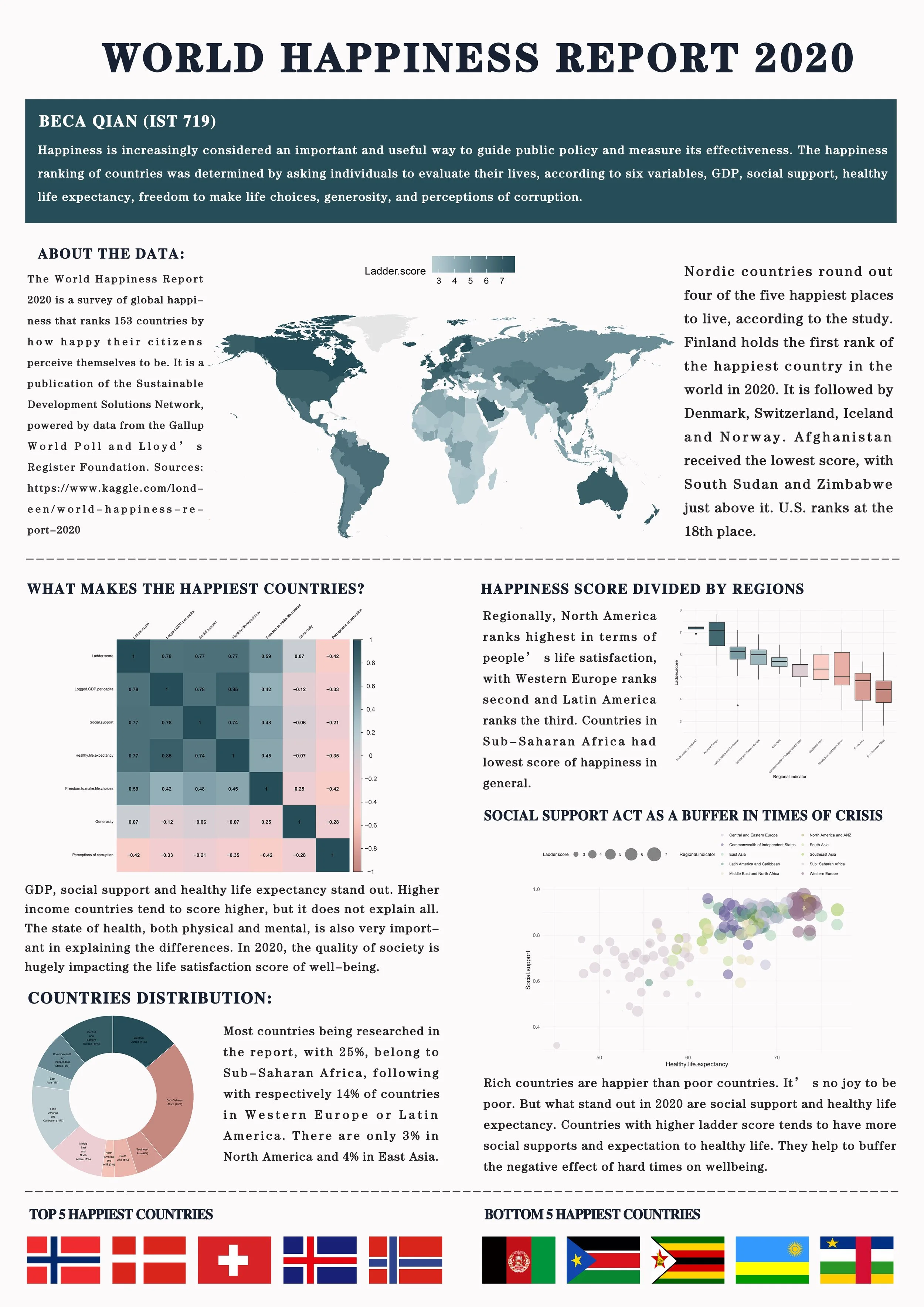
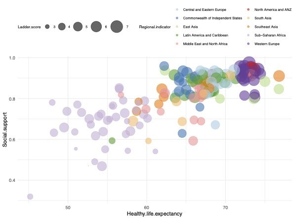
Bubble plot
The correlation between social support and ladder score (happiness score) based on regions.
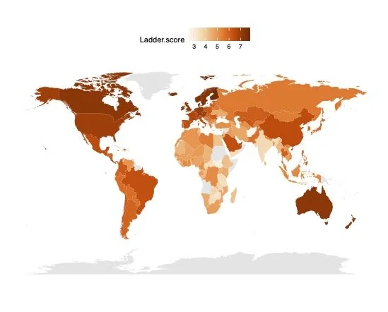
Map
Happiness score based on countries on world map.
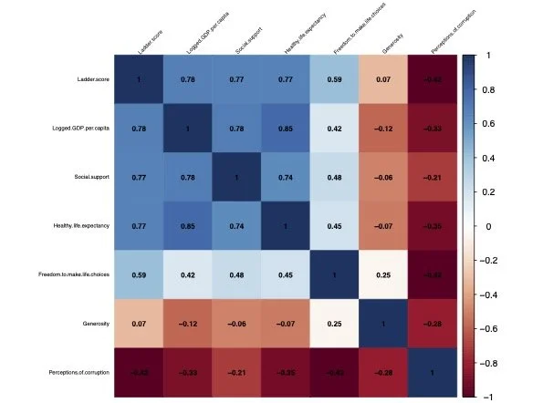
Heat map
The correlation coefficient between each independent variable.